Star Preloader Animation

PROJECT TYPE. GRAPHIC DESIGN

ORGANIZATION. THE VANCOUVER CANUCKS

PROJECT DURATION.  8 MONTHS

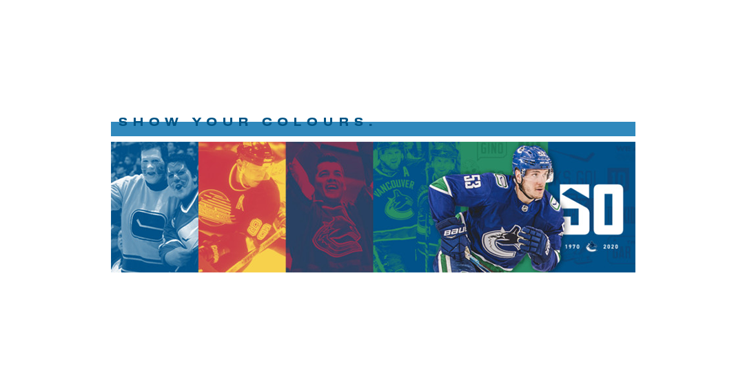
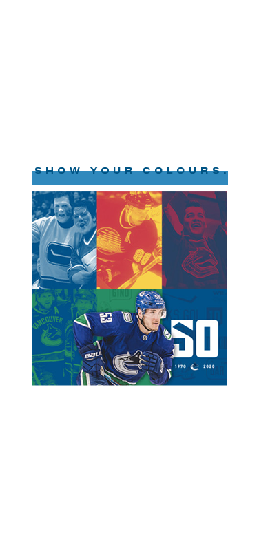
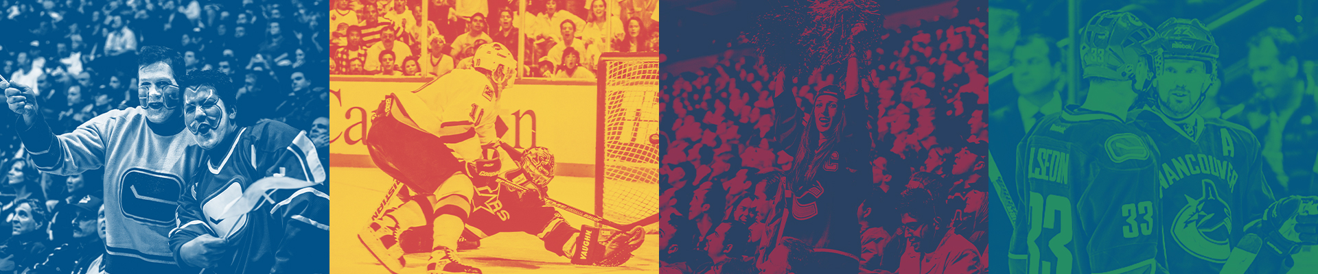
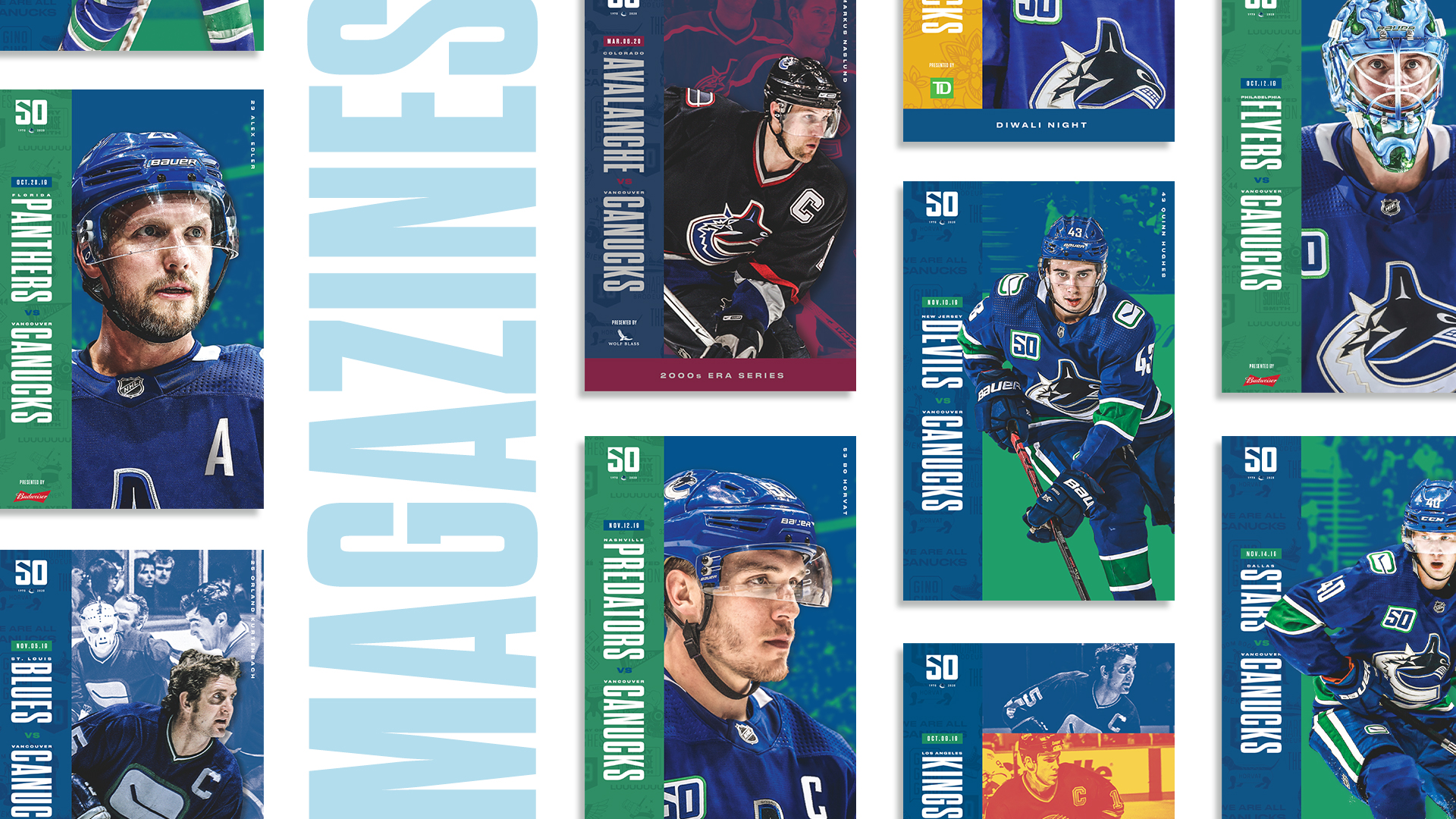
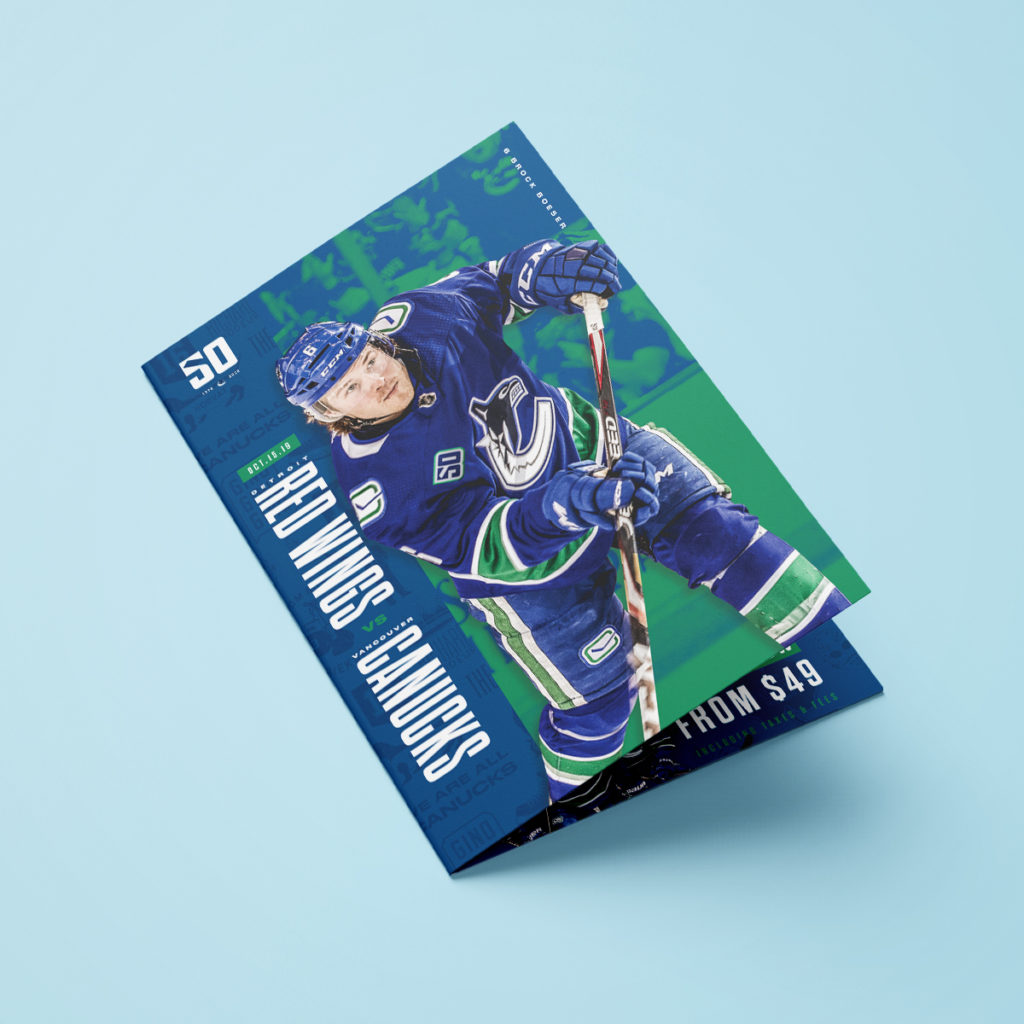
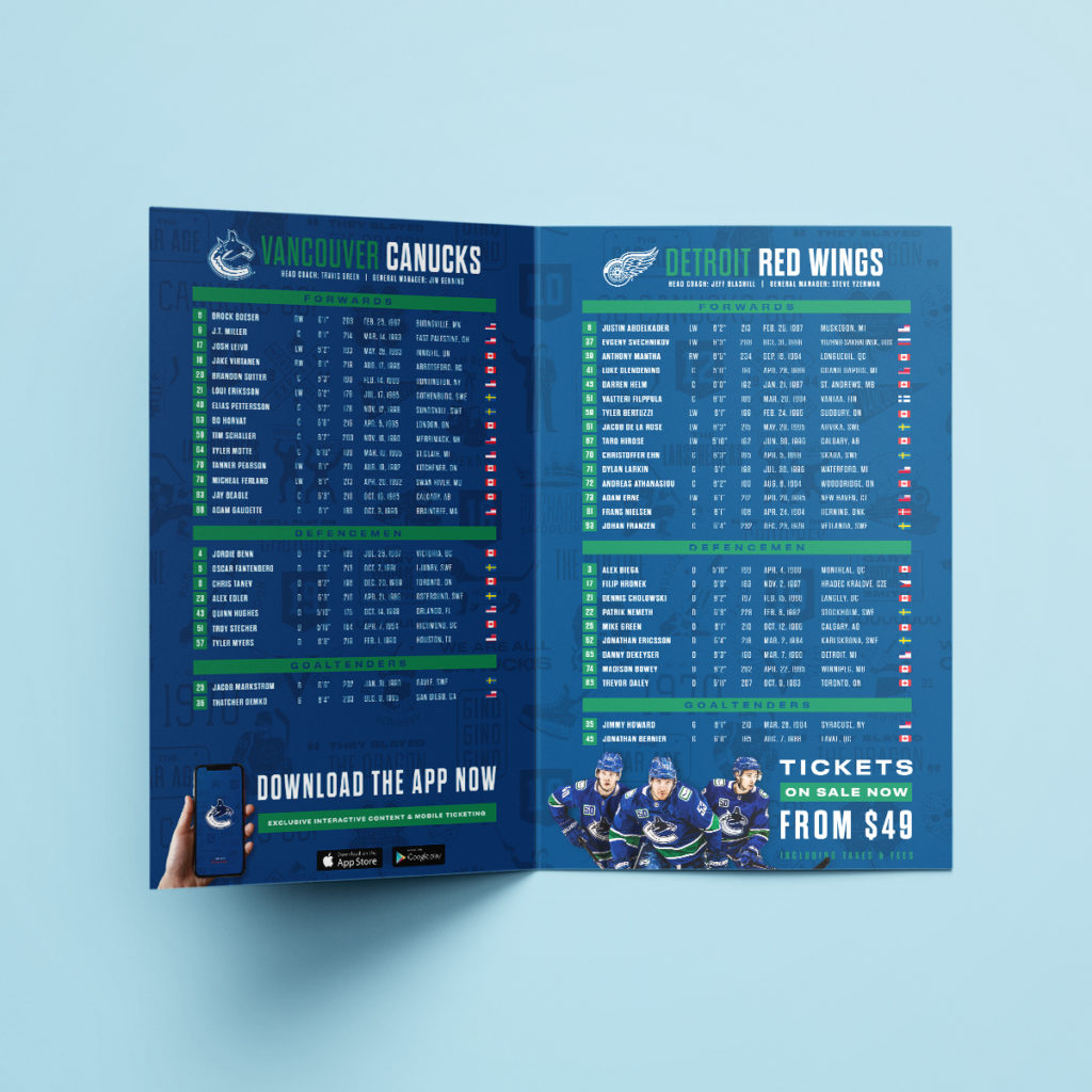
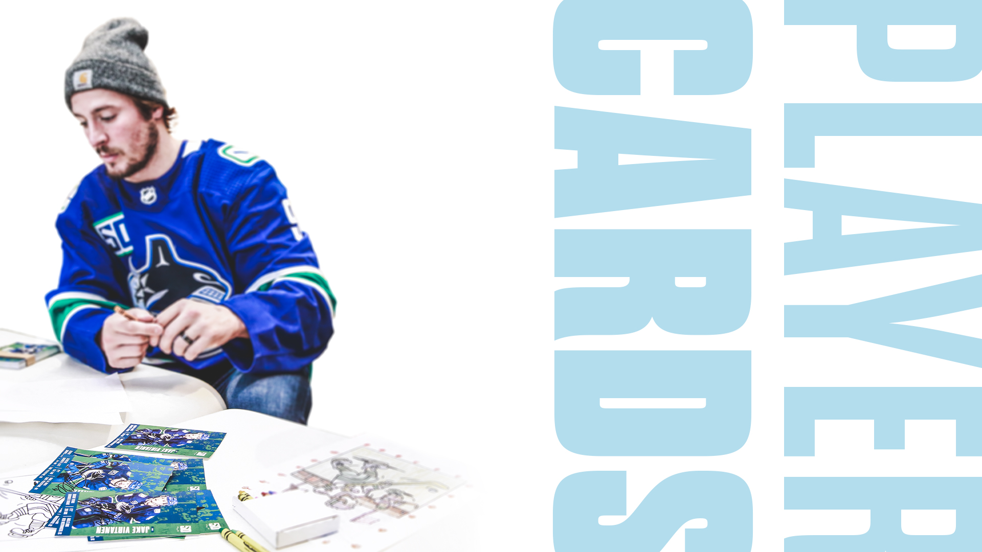
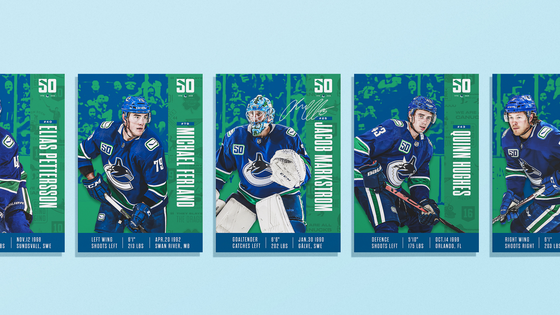
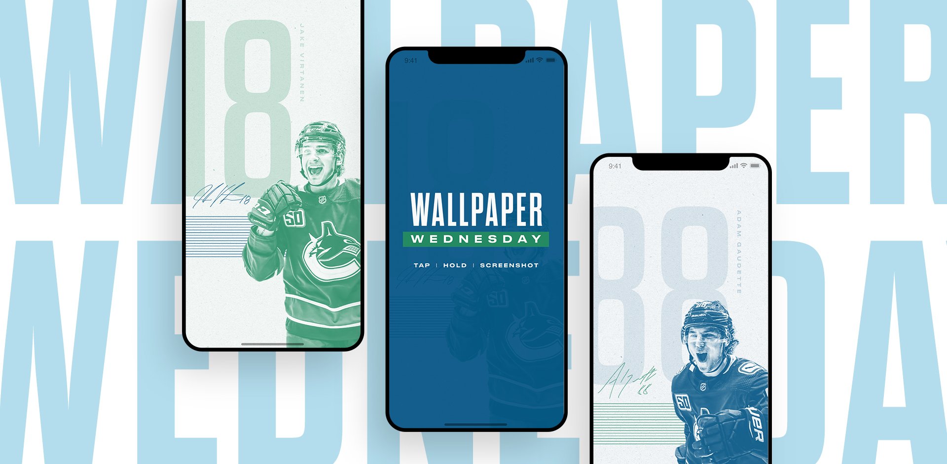
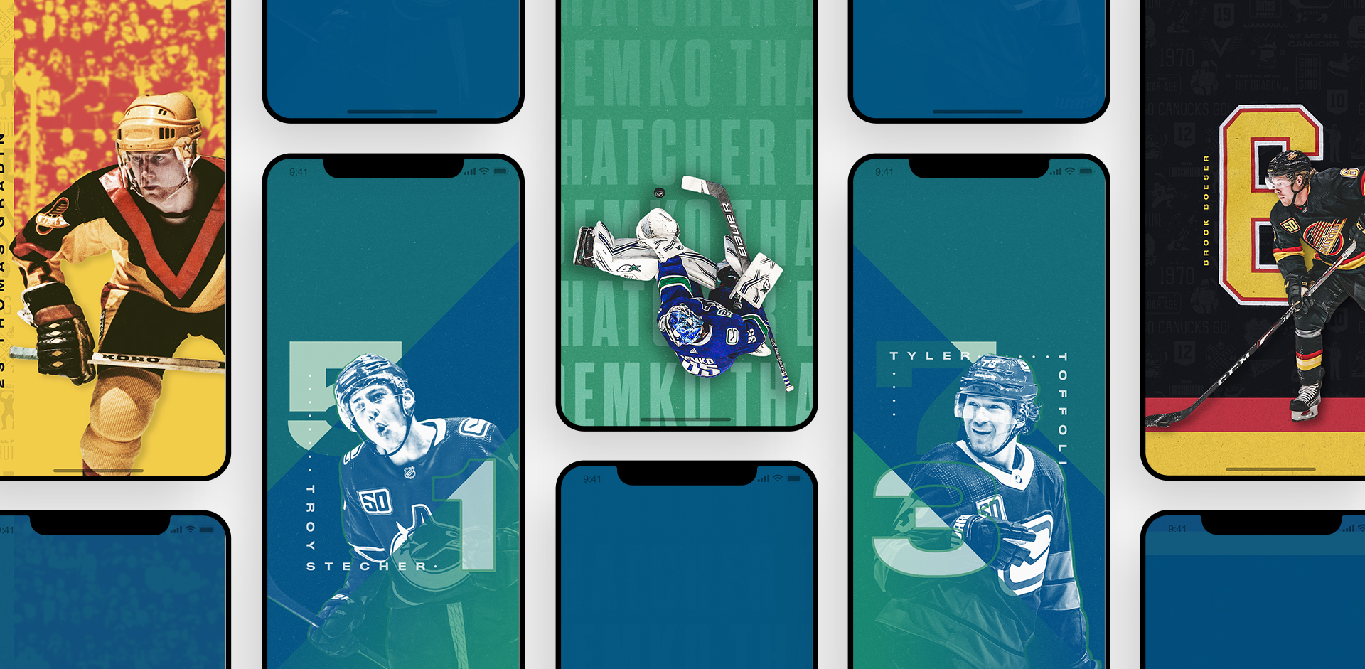
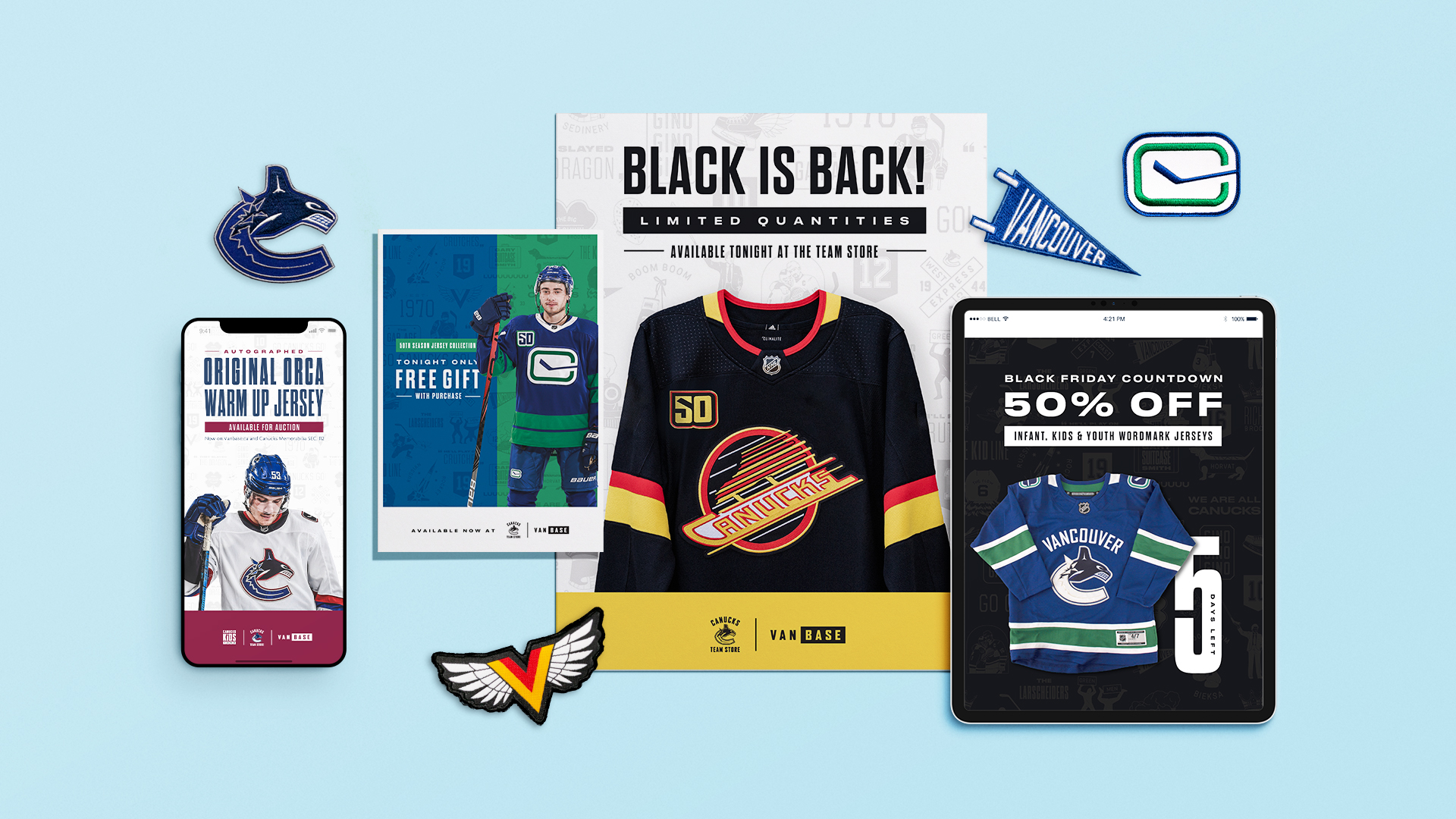
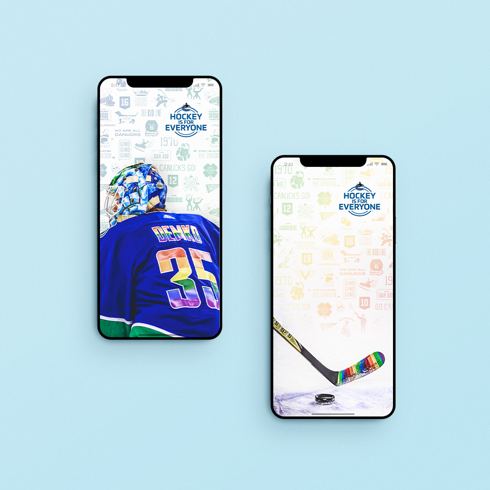
For its 50th Anniversary Season, the Vancouver Canucks campaign sought to honour its rich and colourful past, while simultaneously reminding fans of the teams’ current young talent, and incredibly bright future. This visual direction spanned the entire 2019.20 NHL Regular Season, and provided a jumping off point for the creation of print and digital assets across multiple channels including in-arena messaging, social media features and revenue-generating advertisements.  

The Show Your Colours campaign was seen by an audience of over 2.3 million, and provided fans with a chance to proudly celebrate, and engage with their favourite team. It helped the organization in achieving recent all time highs in ticket sales, membership renewals and in-bowl attendance, and created a newfound buzz around the Vancouver Canucks.  

BRANDING ELEMENTS

A new logo was unveiled in the springtime, as well as a fresh palette, which was decidedly more varied than our typical blue and green. Each era of Canucks hockey was referenced through the use of colour gradients and archived imagery. Icons symbolizing key moments and memorable players were combined to form a tapestry pattern. This was used to create depth and interest, and provided a sense of cohesion amongst the vast array of projects created over the course of the 8-month span.  

LOGO

IMAGE TREATMENT

TAPESTRY ICONS

TYPE CHOICE A

TYPE CHOICE B

TYPE CHOICE B

COLOUR PALETTE

FINAL PRODUCTS

The Canucks’ 50th Season Campaign involved the creation of a wide variety of assets from printed materials, in-arena graphics and digital content. Noteworthy projects include the conceptualization of the 2019.20 Gameday Magazine Rosters, piloting the inaugural edition of our Wallpaper Wednesday social media feature and the execution of Canucks Team Store weekly advertisements.

MAJOR TAKEAWAYS 

The opportunity to be a part of the Canucks 50th Season was a thrilling experience, and working on such a prominent campaign taught me a lot about operating within branding guidelines. Each day was a new opportunity to create something that looked novel, but still fit with the overall visual aesthetic of all other materials. The variety of projects was also a great way to expand my skills in both digital and print arenas.

MORE PROJECTS.